Best Paint Colors for Living Room Spaces
Choosing a paint color for the living room is one of the most impactful decisions in the entire home, since this is usually the room family and guests spend the most time in. The right color can make a space feel larger, calmer, and more inviting, while the wrong choice can leave a room feeling flat, cramped, or oddly lit no matter how good the furniture is. This guide walks through the best paint colors for living room spaces, how to match a color to the room’s light and size, and which shades tend to work well across different styles.
There is no single perfect color that works in every living room, since lighting, room size, and personal style all play a role in how a shade actually looks once it’s on the wall. Instead, the goal is to understand which color families tend to perform well in different situations, then narrow the choice down using a few simple tests before committing to a full room.
Why Paint Color Matters So Much in the Living Room
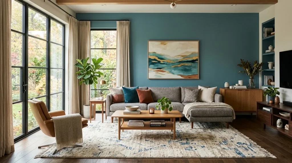
The living room typically has the most natural light exposure, the most furniture variety, and the most foot traffic of any room in the house, which means the wall color has to work with a wider range of conditions than in a bedroom or hallway. A color that looks perfect in a paint store often looks completely different once it’s spread across a large wall and lit by the room’s actual windows and lamps.
- Living rooms usually have more windows, so light changes color perception throughout the day
- Furniture, rugs, and art all need to coordinate with the chosen wall color
- This room is often seen from the entryway, so the color sets the tone for the whole home
- Because the space is used constantly, the color needs to feel good in both daylight and evening lighting
Taking these factors into account before choosing a color helps avoid the common mistake of picking a shade that looked great on a small sample card but feels completely different once it covers an entire room.
1. Warm Neutrals for a Timeless, Versatile Look
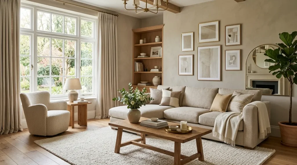
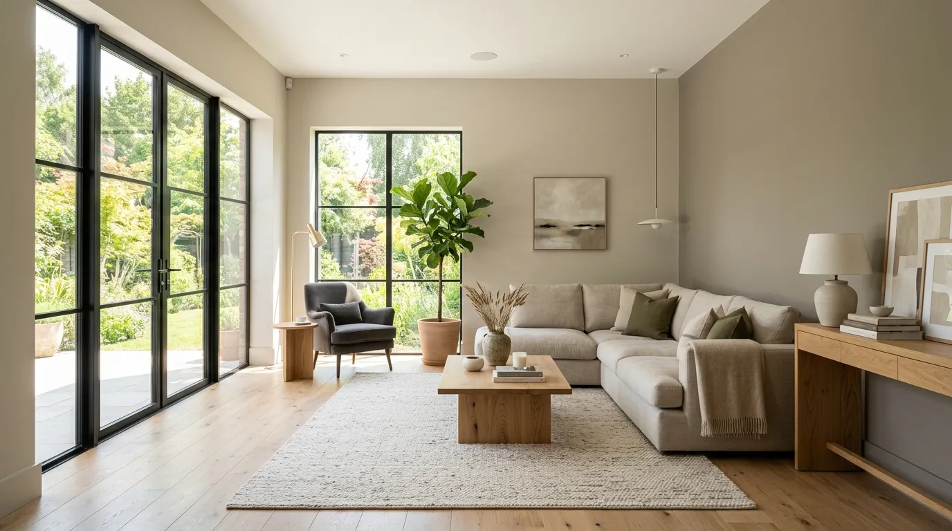
Warm neutrals like greige, sand, and soft taupe remain some of the most popular living room colors because they adapt easily to different furniture styles and lighting conditions. These shades read as calm and put together without feeling cold or sterile, which is why they show up so often in professionally staged homes.
A warm neutral also gives the most flexibility for changing decor over time, since pillows, art, and accent pieces in almost any color will sit comfortably against it. This makes warm neutrals a strong choice for anyone who expects to update their furniture or accessories more frequently than they repaint.
2. Soft White for Small or Dim Rooms
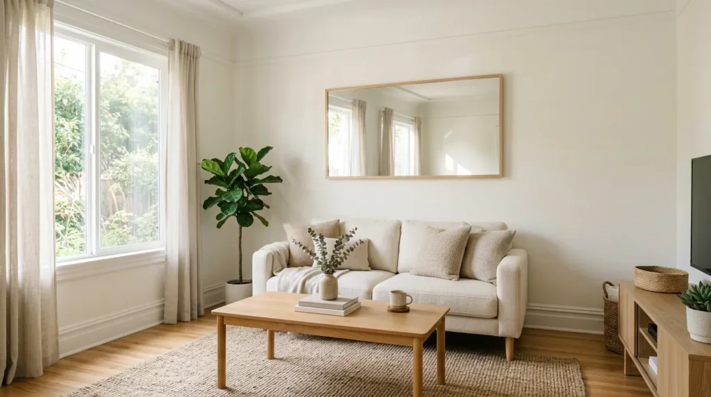
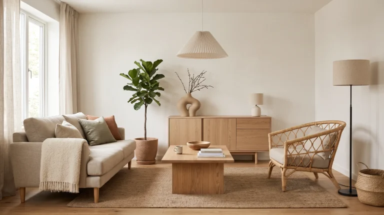
In a smaller living room, or one with limited natural light, a soft white can make the space feel noticeably larger and brighter. Unlike a stark, cool white, a soft white with warm undertones avoids feeling clinical while still reflecting as much light as possible around the room.
Pairing a soft white wall with warmer wood tones and textured fabrics keeps the room from feeling flat, since an all-white palette can sometimes read as plain without enough contrast elsewhere in the space.
3. Deep Green for a Grounded, Natural Feel
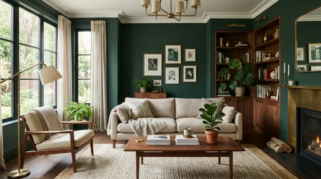
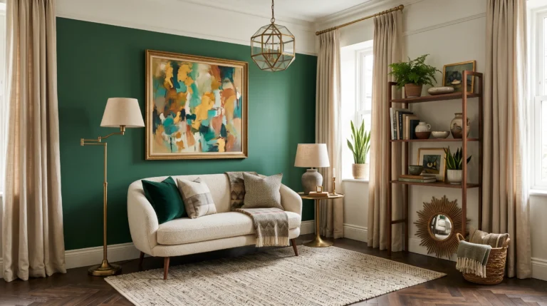
Deep greens, from forest to sage-adjacent hunter tones, have become a favorite for living rooms that are meant to feel cozy and calm rather than bright and open. These shades pair particularly well with brass or wood accents and tend to look richer as natural light shifts throughout the day.
Because deep green is a stronger color choice than a neutral, it works best in rooms with good natural light or when paired with warm lighting in the evening, since the color can read as overly dark in a room that’s dim to begin with.
4. Navy or Charcoal for a Dramatic Statement
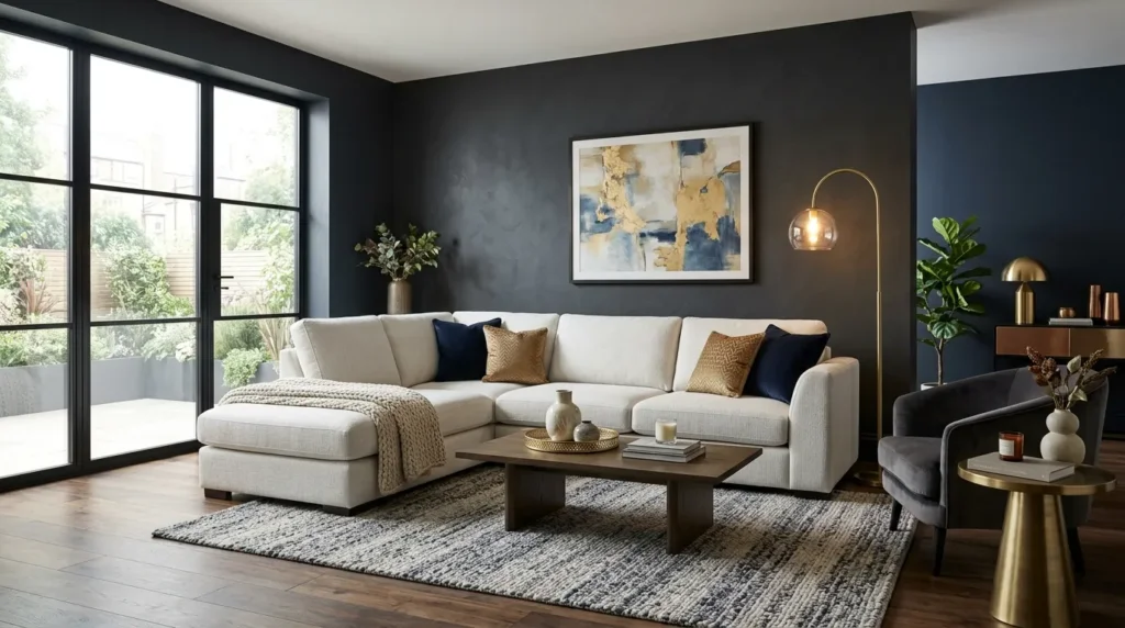
Navy and charcoal are bold choices that work well as either a full room color in a well-lit space or as a single accent wall in a smaller one. These deeper tones create a sense of coziness and sophistication, especially when paired with brighter furniture or metallic accents that stand out against the darker background.
An accent wall is often the safer way to introduce navy or charcoal for anyone hesitant about committing to a darker color across an entire room, since it delivers the dramatic effect without reducing the room’s overall brightness as much as a full application would.
5. Warm Terracotta for Rooms That Need Extra Warmth
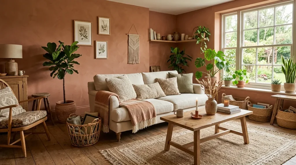
North-facing living rooms, which tend to receive cooler, less direct light throughout the day, often benefit from a warm terracotta or clay-toned wall color. These earthy shades counteract the coolness of the natural light and make the room feel more inviting, particularly during colder months.
Terracotta tones also pair naturally with greenery, woven textures, and warm wood furniture, making them a strong fit for living rooms styled around a relaxed, organic aesthetic.
6. Compare Popular Color Families at a Glance
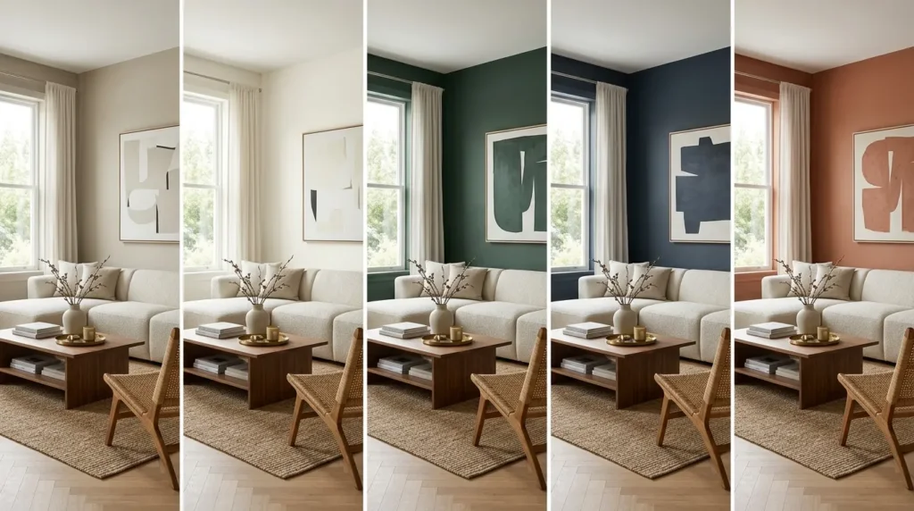
Since the right color depends heavily on the room’s light and intended mood, here’s a quick comparison of the main color families covered above:
| Color Family | Mood It Creates | Works Best In |
| Warm neutrals (greige, sand) | Calm, cozy, versatile | Rooms with lots of natural light |
| Soft whites | Bright, open, airy | Small or dim living rooms |
| Deep greens | Grounded, rich, natural | Rooms used for reading or relaxing |
| Navy or charcoal | Dramatic, sophisticated | Accent walls or formal living rooms |
| Warm terracotta or clay | Inviting, earthy | North-facing rooms needing warmth |
This kind of side-by-side comparison is useful early in the decision process, since it narrows the color families down to two or three that suit the room’s lighting and purpose before any specific paint swatches are chosen.
7. Test Before Committing to a Full Room
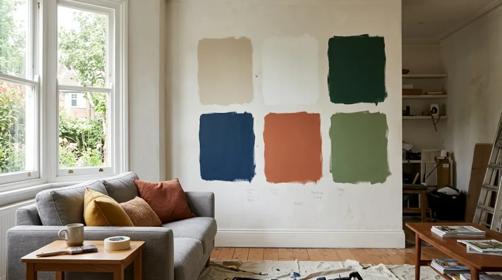
Paint always looks different on a small swatch than it does across an entire wall, which is why testing a color in the actual room is one of the most important steps in the process. Painting a large sample swatch, at least two feet by two feet, directly on the wall and observing it at different times of day gives a much more accurate sense of how the color will behave.
- Test the color on more than one wall, since light exposure often differs by direction
- View the sample in both daylight and lamp light before deciding
- Let the sample dry fully, since wet paint often looks darker and more saturated than the final result
Skipping this step is one of the most common reasons a chosen color ends up feeling wrong once the whole room is painted, so it’s worth the extra day or two before committing to full cans of paint.
8. Consider the Room’s Existing Fixed Elements
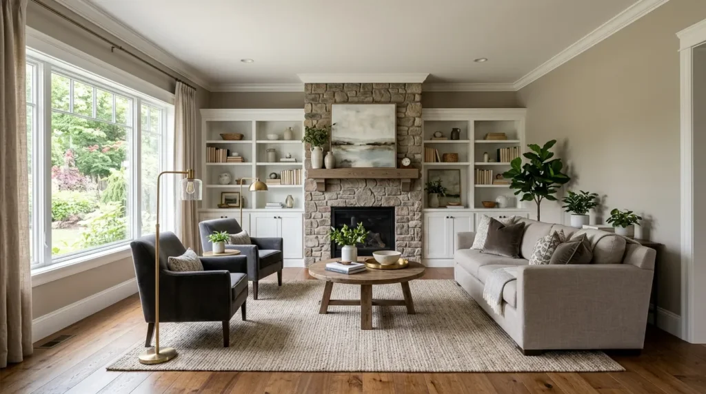
Flooring, trim, built-in shelving, and fireplace surrounds are usually far more expensive to change than paint, which means the wall color should be chosen to complement these existing elements rather than fight against them. A warm wood floor, for example, generally pairs better with warm neutrals or earthy tones than with a cool, blue-based gray.
Taking a photo of the room and viewing paint swatches against it, either physically or using a paint brand’s digital visualization tool, can help confirm that a chosen color works well with these fixed elements before any paint goes on the wall.
9. Match the Finish to the Room’s Use
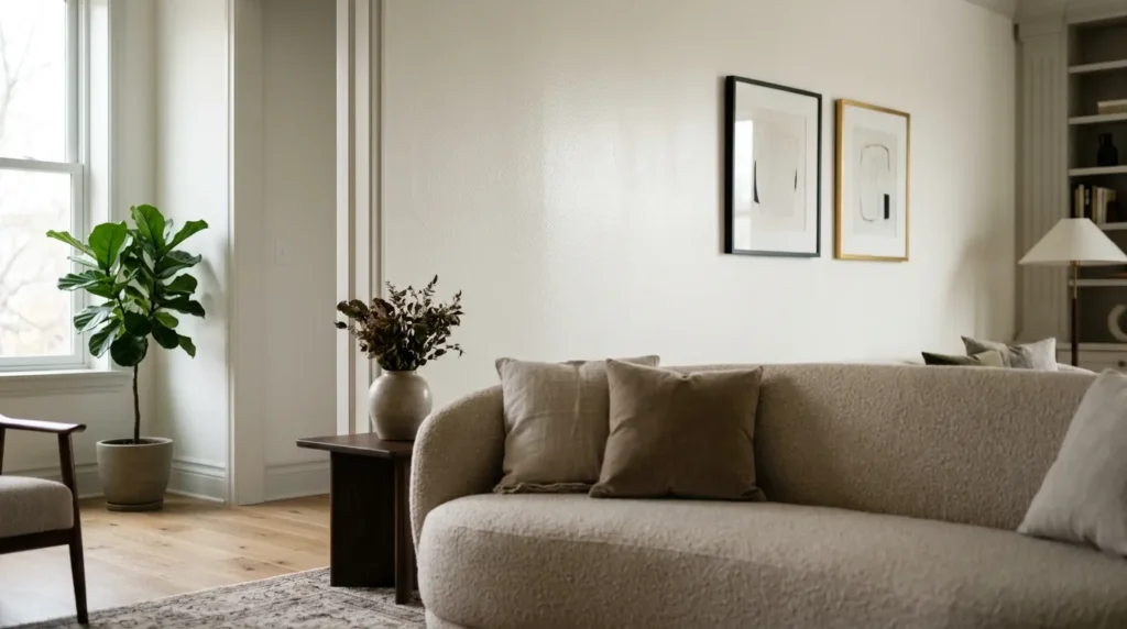
Beyond color, the paint finish also affects how a living room looks and holds up over time. Eggshell and satin finishes are popular for living rooms because they offer a subtle sheen that’s easy to clean without looking overly glossy, which matters in a room that sees frequent use and occasional scuffs.
A flat or matte finish can look elegant on walls but tends to show marks more easily and can be harder to wipe clean, so it’s often better reserved for rooms with lower foot traffic than a busy living room.
Final Thoughts
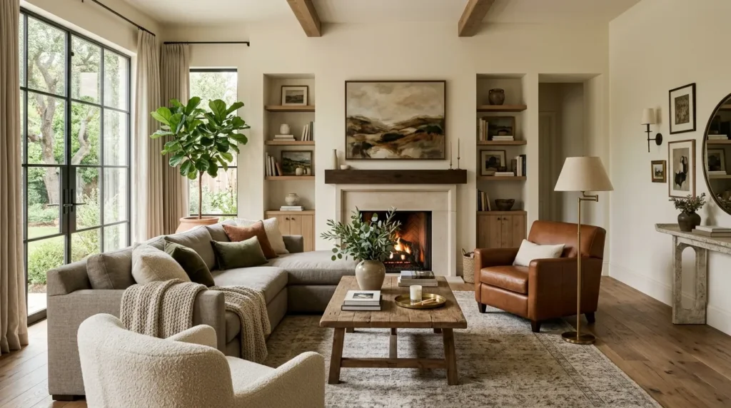
There’s no universal best paint color for every living room, but understanding how warm neutrals, soft whites, deep greens, navy, and terracotta each perform in different lighting and room sizes makes the decision much easier. Testing a shortlist of colors directly on the wall, and considering the room’s fixed elements before committing, helps ensure the final choice feels intentional rather than accidental.
Approaching the decision with a bit of patience, rather than rushing to a single can of paint on the first store visit, almost always leads to a result that feels more considered and lasts longer before the next update feels necessary.
Frequently Asked Questions
1. What is the most popular paint color for living rooms right now?
Warm neutrals such as greige and soft taupe remain among the most requested living room colors, largely because they work well with a wide range of furniture styles and lighting conditions. Their versatility makes them a safe choice for homeowners who plan to update decor more often than they repaint.
2. What color makes a small living room look bigger?
A soft white with warm undertones tends to make a small living room feel larger and brighter, since it reflects more available light around the space. Adding warm wood tones and textured fabrics alongside the white keeps the room from feeling flat or clinical.
3. Are dark colors a bad choice for a living room?
Dark colors like navy or charcoal can work very well in a living room, particularly one with good natural light or when used on a single accent wall rather than the entire space. They create a cozy, dramatic effect that pairs nicely with brighter furniture and metallic accents.
4. How do I know if a color will work with my room’s lighting?
The most reliable way to check is by painting a large sample swatch directly on the wall and observing it at different times of day, in both natural daylight and lamp light. This reveals undertones and shifts in the color that a small paint chip or online swatch usually cannot show.
5. Should the paint finish matter as much as the color?
Finish matters nearly as much as color in a living room, since this space sees frequent use and occasional marks. An eggshell or satin finish is generally the better choice, since it offers enough sheen to be wiped clean easily without looking overly glossy on a large wall.