Small Living Room Color Ideas to Try This Year
Color has more influence over how a small living room feels than almost any other design choice. The right palette can make a compact room feel open and calm, while the wrong one can make even a decent sized room feel closed in and heavy. These small living room color ideas walk through the shades, combinations, and application tricks that actually make a difference in a tight space, so you can pick a direction with real confidence instead of guessing at paint chips in the store. A single well chosen color can do more for a small room’s feel than an entire new furniture set.
Why Color Matters So Much in a Small Room
In a large room, a bold or dark color can read as dramatic and intentional without overwhelming the space, since there’s enough square footage to balance it out. In a small room, that same color often eats up the visual space instead, making the walls feel closer and the ceiling feel lower than it actually is.
A few reasons color choices carry more weight in a small living room:
- Walls make up a bigger share of what the eye sees in a tight room
- Dark colors absorb light, which is already limited in a small space
- Fewer furniture pieces mean the wall color becomes the room’s main statement
- Color choices affect how connected a small room feels to adjoining spaces
Understanding this makes it much easier to choose colors with intention rather than trend chasing.
1. Soft White as a Flexible Base
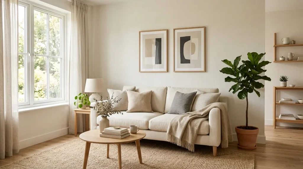
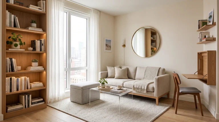
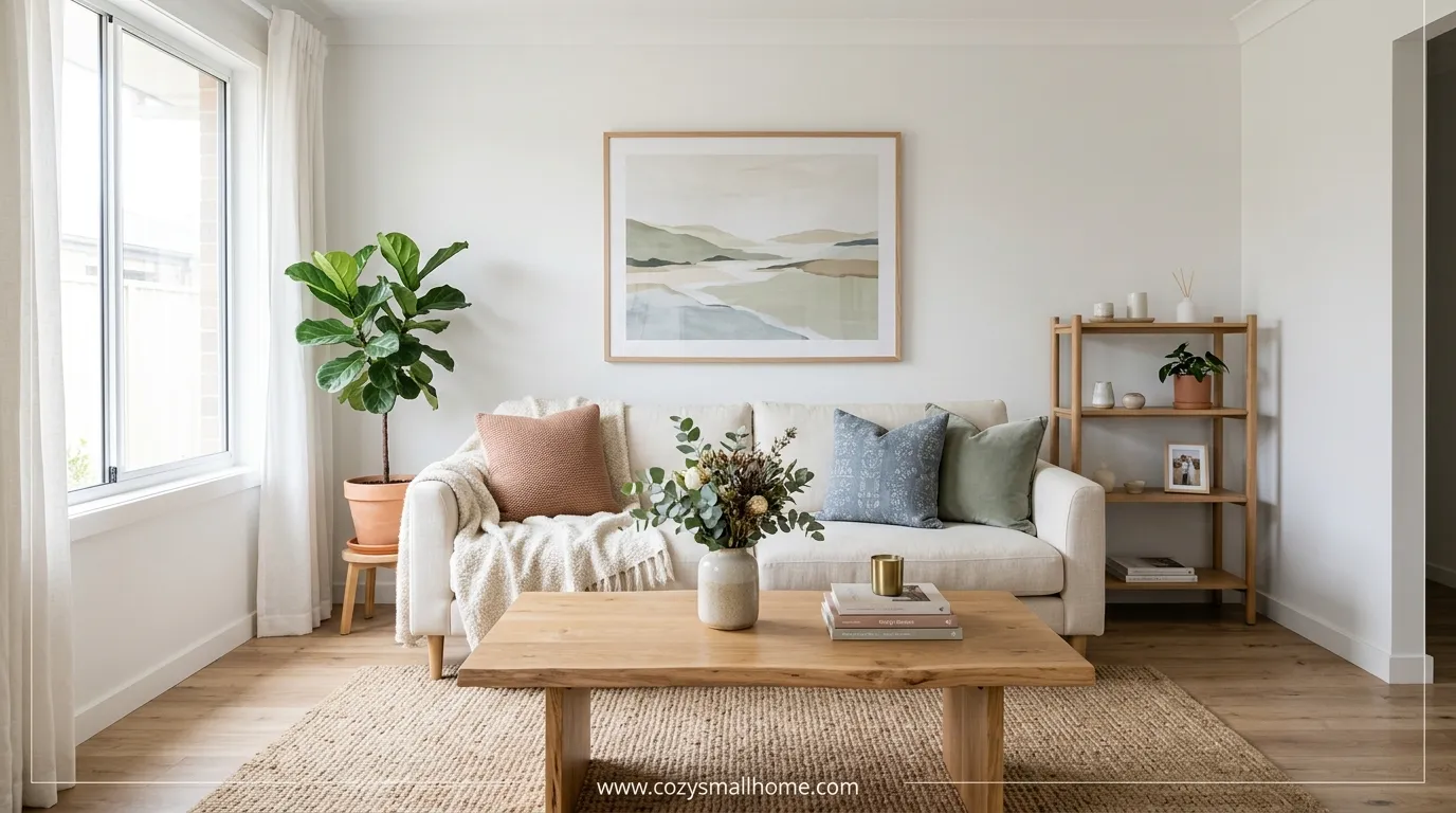
Soft white, as opposed to a stark, cool white, gives a room brightness without feeling clinical. It reflects light well and pairs easily with almost any accent color, which makes it one of the safest and most flexible small living room color ideas for renters or anyone planning to change their decor often. Since it works as a neutral backdrop, you can rotate pillows, art, and throws seasonally without the base color ever feeling outdated.
2. Warm Beige for a Cozy Neutral

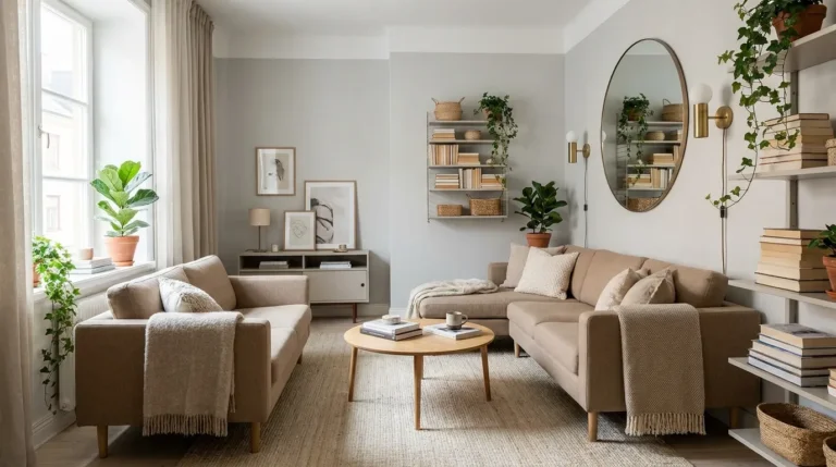
Beige has a reputation for being boring, but a warm, slightly golden beige actually adds depth and coziness that plain white can lack. It works particularly well in rooms with a lot of natural light, since the warmth keeps the space from feeling washed out. Pairing it with cream and soft brown accents keeps the whole room feeling warm without introducing any true color at all.
3. Sage Green for a Calming Effect
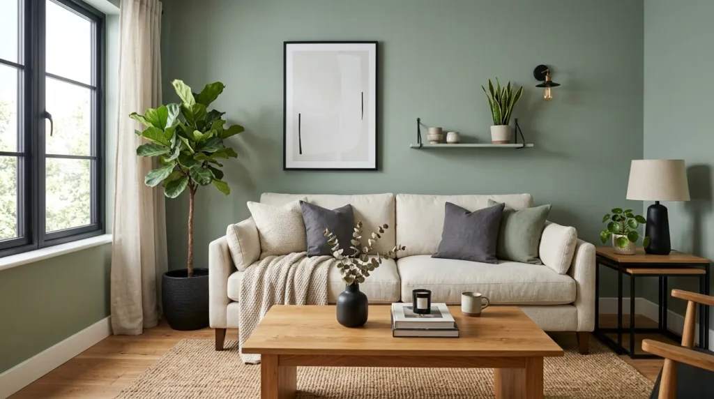
Sage green sits in that sweet spot between neutral and colorful, adding personality to a room without overwhelming a small space. Its muted, grayish undertone keeps it from feeling too bold, which makes it a popular choice for anyone who wants color without commitment. It also pairs beautifully with both warm wood tones and cooler black accents, giving it more flexibility than most other greens.
4. Pale Blue for an Airy Feel
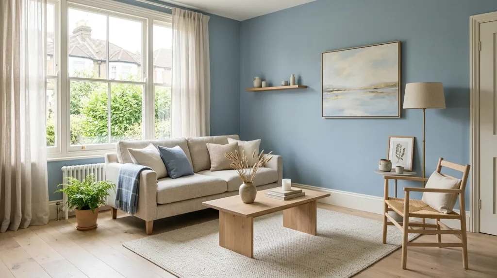
Light, dusty blue tones have a naturally calming, spacious quality that works well in small rooms, especially ones with limited natural light. Pairing pale blue walls with white trim keeps the room feeling fresh rather than cold. This combination also tends to read well in both north facing rooms that get cooler light and sunnier rooms that could use a calming counterbalance.
5. Terracotta as a Warm Accent
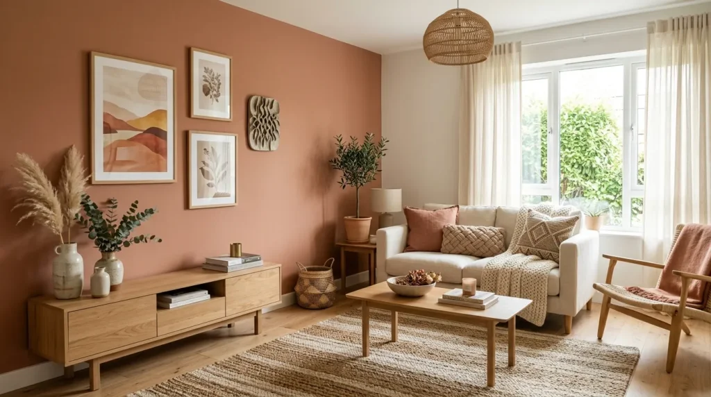
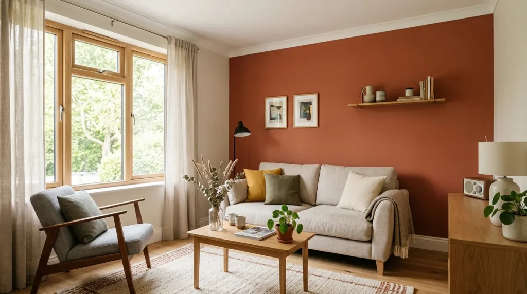
A muted terracotta wall or a few terracotta accessories bring warmth into a room without the intensity of a bright orange. It pairs particularly well with wood tones and cream colored furniture, giving the room an earthy, grounded feeling. Since it leans more muted than vibrant, it holds up well over time instead of feeling like a passing trend.
6. Use One Bold Color on a Single Wall
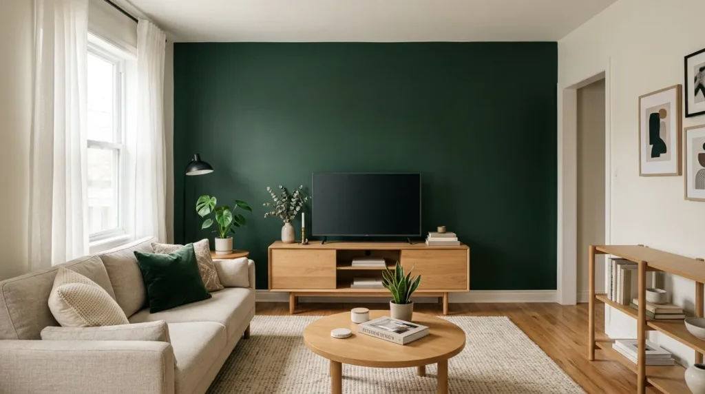
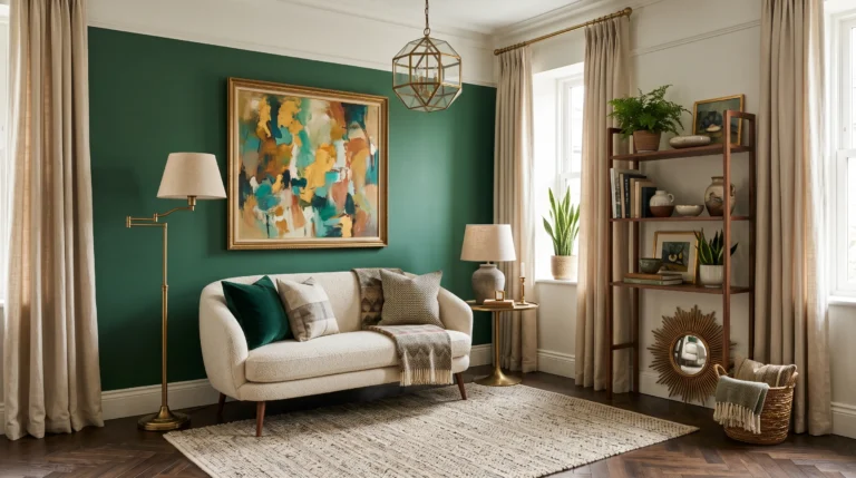
Committing an entire room to a bold color can feel risky, but isolating that color to one accent wall gives you the drama without the overwhelm. It also gives you an easy way to test a color you’re unsure about before committing to it across the whole room. A few bold colors that work well as a single accent wall:
- Deep forest green behind a media console or bookshelf
- Rich navy blue behind the sofa
- Warm rust or brick red in a dining nook adjacent to the living room
Keeping the remaining walls neutral lets the accent wall stand out as a deliberate design choice rather than an overwhelming color everywhere you look.
7. Monochromatic Color Schemes
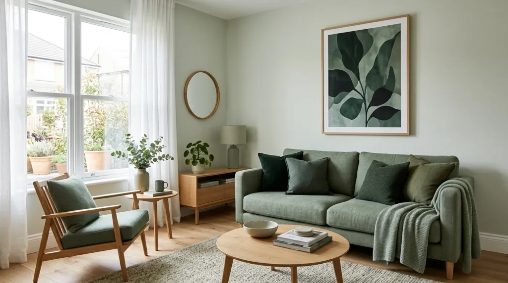
Building a room around different shades of the same color family, like light, medium, and dark tones of blue or green, creates a cohesive look that reads as intentional and expansive. This approach avoids the choppy, closed in feeling that can happen when too many unrelated colors compete for attention in a small space, and it tends to photograph well since nothing fights for visual dominance.
How to Build a Monochromatic Room
- Pick one base color you genuinely love
- Choose a lighter tint of that color for the walls
- Add a medium shade through furniture like a sofa or an accent chair
- Layer in the darkest tone through smaller accessories like pillows or art
This method keeps the room feeling unified while still giving it visual depth.
8. Blush Pink for Softness
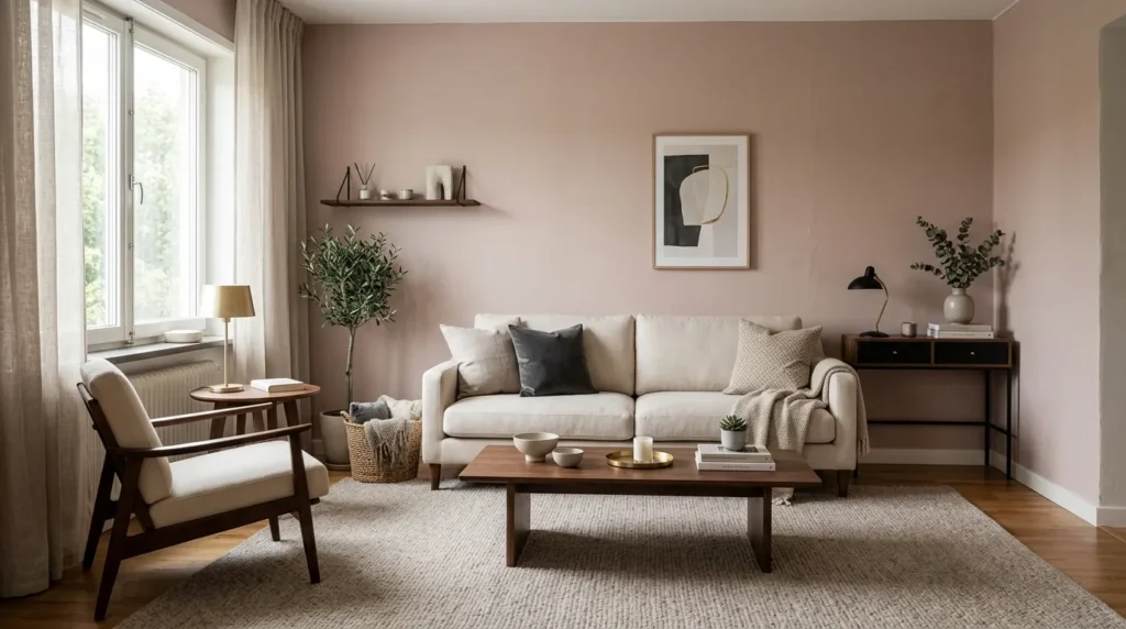
A muted, dusty blush pink brings warmth and softness into a room without feeling overly sweet or juvenile, especially when paired with black or dark wood accents to ground the palette. It works particularly well in living rooms that also serve as a reading nook or a quiet retreat space. Keeping the rest of the room fairly neutral lets the blush tone read as sophisticated rather than overly playful.
9. Charcoal Gray as a Grounding Accent
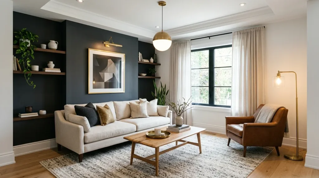
While dark colors are generally trickier in small rooms, a charcoal accent wall paired with plenty of white trim and good lighting can actually add sophistication rather than closing the room in. This works best when balanced with lighter furniture and a few metallic or wood accents to keep the room from feeling too heavy. Using it on just one wall, rather than the full room, keeps the drama contained and intentional.
10. Use Color Through Textiles Instead of Walls
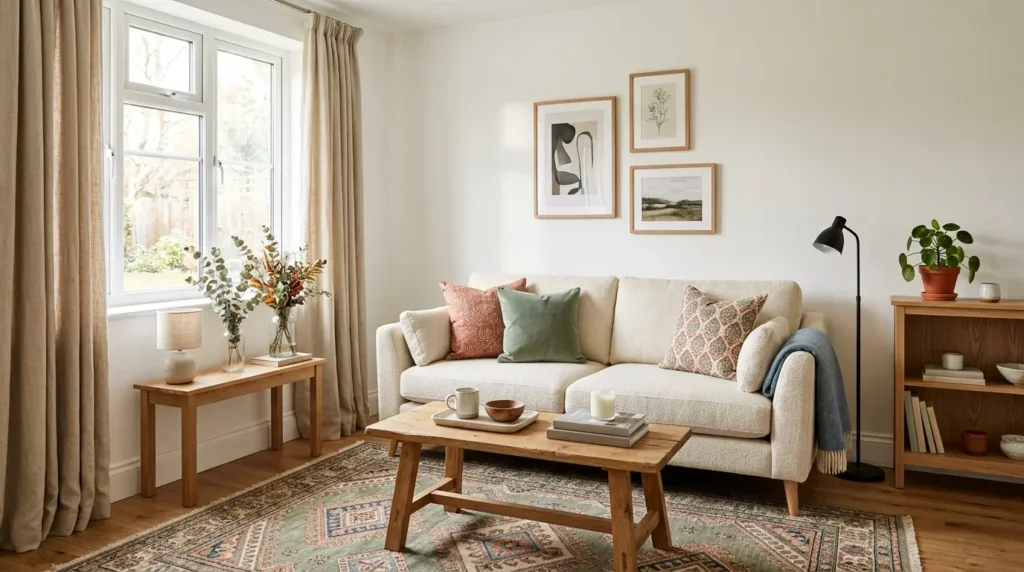
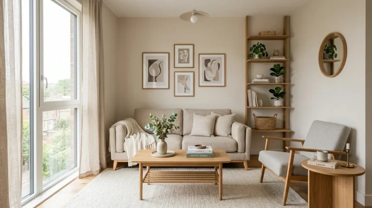
If committing to a wall color feels risky, introducing color through rugs, pillows, and curtains gives you the same visual impact with far less commitment. This approach also makes it easy to update the room’s color story seasonally without repainting anything, since swapping a few textiles takes far less time and money than a full paint job.
11. Keep Trim and Ceiling Lighter Than Walls
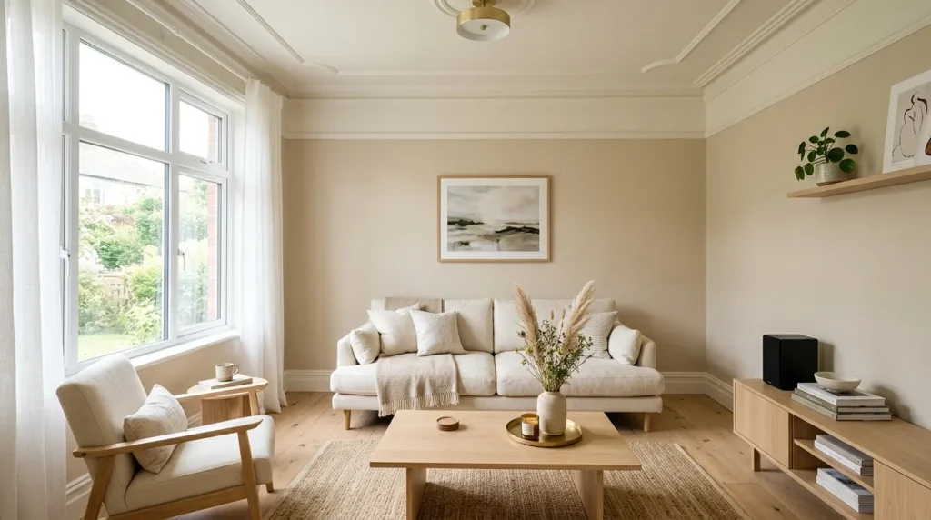
Painting the trim and ceiling a shade lighter than the walls, even by a small degree, helps define the architecture of the room and keeps it from feeling boxed in. This small contrast adds a sense of structure that a single flat color across every surface doesn’t provide, and it draws the eye upward in a way that makes the ceiling feel taller than it measures.
Final Thoughts
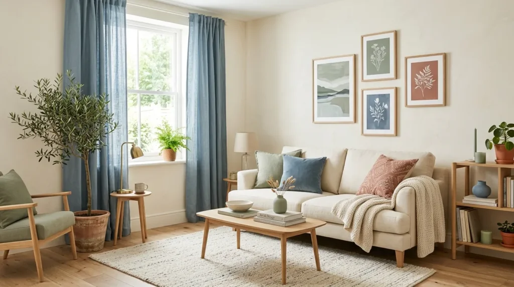
Choosing the right palette is one of the most affordable and impactful changes you can make in a compact space. These small living room color ideas prove that color doesn’t have to mean sacrificing openness, as long as you’re thoughtful about undertones, finishes, and where bold choices get used. Start with a neutral base, then layer in one or two colors you genuinely love, and the room will feel both bigger and more like you. Testing a sample on the wall for a few days before fully committing is always worth the extra step, since lighting changes how a color reads throughout the day.
Frequently Asked Questions
- What is the best color for a small living room? Soft white, warm beige, and sage green are consistently strong choices since they reflect light while still adding warmth.
- Do dark colors always make a small room feel smaller? Not always. A dark accent wall paired with good lighting and lighter furniture can add depth instead of closing the room in.
- Should the ceiling be the same color as the walls? A slightly lighter ceiling color usually helps define the room’s height and keeps it from feeling boxed in.
- What paint finish works best in a small living room? Eggshell or satin finishes reflect a bit more light than matte, which helps a small room feel brighter.
- Can I add color without repainting the walls? Yes. Rugs, pillows, and curtains bring in color and personality without any long term commitment.