
7 Two-Tone Tricks: How to Make a Room Look Bigger With Paint
Paint is the cheapest renovation you’ll ever do, and it’s also the one most people underuse. Rolling one light color across four walls is the standard advice for small spaces, but it’s not actually the most effective approach. In many rooms, a single flat color makes walls feel like a closed box rather than an open space.
Two-tone painting works differently. By using two related colors in deliberate places, you can shift where the eye stops, raise perceived ceiling height, and blur the corners that make a room feel confined. Understanding how to make a room look bigger with paint is less about picking the lightest shade on the swatch card and more about controlling where contrast falls.
Below are seven two-tone techniques that genuinely change how a room reads, along with the specific details that determine whether each one works or backfires.
Why Two Colors Often Beat One in a Small Room
The eye judges room size partly by where it finds edges. Every time it hits a hard line—a dark baseboard, a contrasting trim, a sharp corner—it registers a boundary. A room full of visible boundaries reads as small, even if the square footage says otherwise.
Two-tone painting gives you control over which edges are visible and which disappear. Done well, it removes the boundaries you don’t want noticed and adds visual interest where it won’t cost you perceived space. This is the underlying principle behind almost every technique below, and it’s why a strategically painted room can feel larger than the same room painted a single uniform shade.
1. Paint the Ceiling Lighter Than the Walls
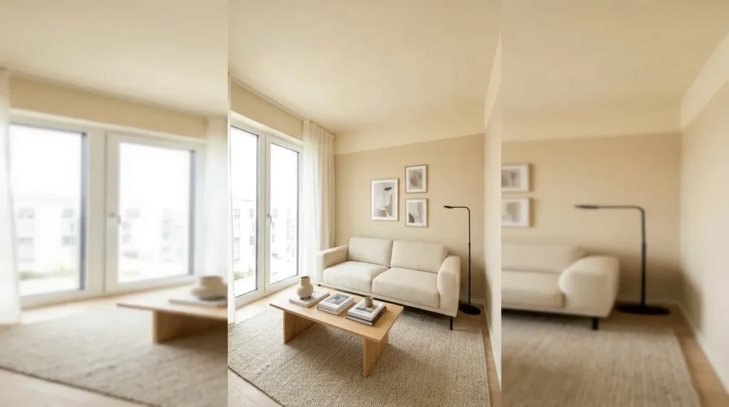
This is the most reliable two-tone trick for adding perceived height, and it’s the one most worth doing first.
When the ceiling is lighter than the walls, it recedes visually, reading as further away than it actually is. The effect is subtle but consistent, and it works in nearly any room regardless of style. Many people already paint ceilings white by default, but the trick works better when the contrast is intentional rather than accidental.
How to do it well:
- Use a flat or matte finish on the ceiling to prevent light glare, which draws attention to the surface
- Choose a ceiling shade two or three steps lighter than the wall color on the same swatch strip, so the tones relate rather than clash
- Avoid a bright, cool white if your walls are warm-toned, since the mismatch reads as a hard boundary rather than a soft transition
For rooms with low ceilings specifically, this single change often makes more difference than any other paint decision you could make.
2. Carry the Wall Color Onto the Ceiling
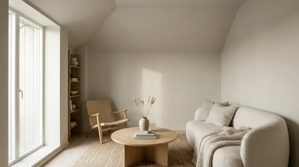
This one sounds like the opposite of the first technique, and in a sense it is, but it solves a different problem.
In rooms where the ceiling line feels abrupt—especially rooms with sloped ceilings, dormers, or awkward angles—continuing the wall color up and across the ceiling removes the visible break between wall and ceiling entirely. Without that line, the eye doesn’t register where one plane ends and the next begins, and the space reads as more continuous.
This approach works best in:
- Attic conversions and rooms with sloped ceilings
- Rooms with lots of architectural interruptions, like beams or bulkheads
- Bedrooms where a cocooning, enveloping feel is desirable
The trick is choosing a color light enough that the enclosure feels soft rather than heavy. Pale neutrals, soft greys, and muted pastels tend to work. A saturated color used this way will feel intentional and dramatic, but it won’t make the room look bigger.
3. Paint the Trim the Same Color as the Walls
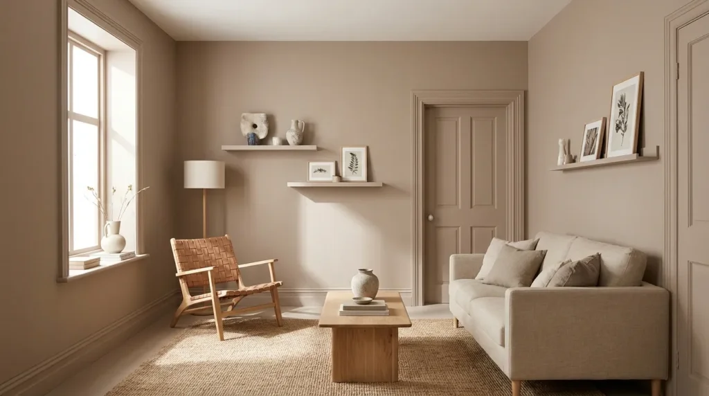
Traditional decorating says trim should be white and walls should be colored. In a small room, that convention actively works against you.
White trim against a colored wall creates a bright outline around every door, window, and baseboard. Those outlines act like a frame, and a framed wall reads as a defined, finite surface. Painting trim the same color as the walls—even in a different sheen—makes those edges vanish.
This is one of the more counterintuitive answers to how to make a room look bigger with paint, but it’s also one of the most effective. The room stops looking like a series of outlined panels and starts reading as one continuous volume.
Practical notes:
- Use a satin or semi-gloss on trim and matte on walls, so the surfaces still read as distinct up close without creating a color boundary
- This works especially well on baseboards, which otherwise draw a hard line at floor level and visually shorten walls
- If you have genuinely beautiful architectural trim worth showing off, this technique isn’t for you — it will hide the detail
4. Use a Low Two-Tone Split Instead of a High One
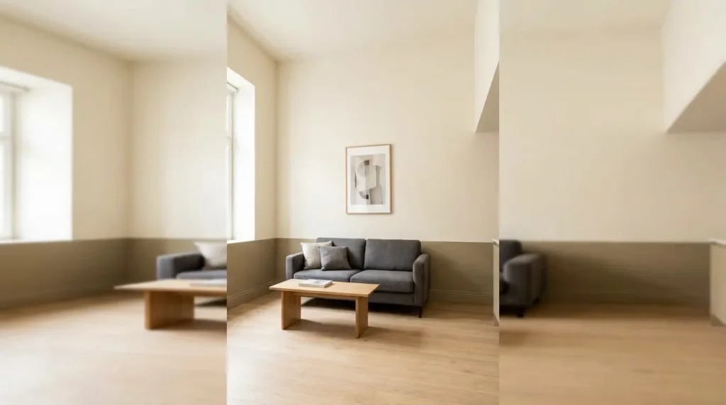
Horizontal two-tone walls — darker on the bottom, lighter on top — are a classic look. But where you place the dividing line determines whether the room grows or shrinks.
The common instinct is to split the wall at chair-rail height, around 36 inches. In a small room, that placement chops the wall roughly in half, and the eye reads the shorter of the two sections as the wall height. The result is a room that feels lower than it is.
Dropping the split line much lower — to around 24 to 30 inches, or even just above the baseboard — fixes this. The lighter upper section becomes dominant, the darker band reads as a grounding detail rather than half the wall, and the ceiling appears further away.
A useful guideline: the lighter section should occupy at least two-thirds of the wall height. Below that ratio, the two-tone effect starts costing you perceived height rather than adding it.
5. Try a Vertical Two-Tone to Widen a Narrow Room
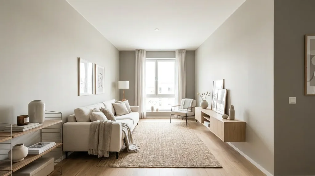
Horizontal splits address height. Vertical two-tone addresses width, which matters in narrow rooms like galley kitchens, hallways, and long, skinny bedrooms.
The technique: paint the two short end walls a slightly deeper shade than the long side walls. The deeper end walls advance visually, pulling the short ends of the room closer and making the proportions read as more square than rectangular.
This works because narrow rooms feel narrow specifically because of the contrast between their long and short dimensions. Reducing the apparent length shrinks that gap, and the room stops reading as a corridor.
Keep the difference subtle. Two or three shades apart on the same color strip is enough — a strong contrast will make the end walls feel like they’re closing in rather than gently adjusting the proportions.
6. Extend the Wall Color Into Adjacent Spaces
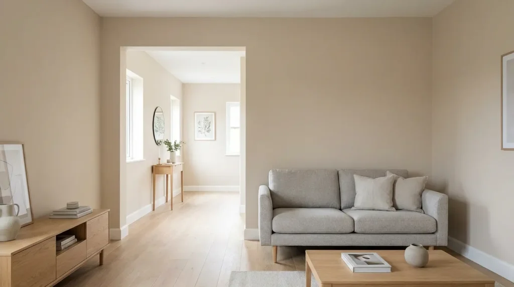
A small room feels smaller when it’s clearly bounded on every side. One of the most underrated ways to combat this is to carry your wall color through doorways into hallways or adjoining rooms.
When the color continues past a doorway, the eye doesn’t stop at the threshold. It reads the two spaces as connected, which borrows perceived volume from the neighboring area. The effect is strongest with open doorways, archways, and rooms that flow into each other without doors.
Where this works particularly well:
- A small living room opening into an entryway or hall
- A bedroom connected to a walk-in closet or ensuite
- An open-plan kitchen and dining area that would otherwise read as two cramped zones
If you want variation between spaces, use different shades from the same color family rather than genuinely different colors. The transition stays soft, but each room still has its own character.
7. Paint a Feature Wall at the Far End of the Room
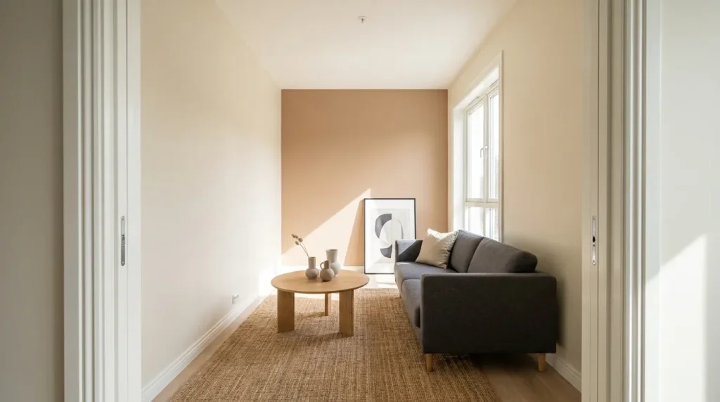
Feature walls have a reputation for being dated, but the placement principle behind them is sound when applied deliberately.
Painting the wall furthest from the entry in a slightly deeper tone creates depth. That wall recedes, the room reads as longer, and the eye travels the full length of the space rather than stopping short. The key word is slightly — this is not the place for a dramatic accent color.
Where the feature wall goes matters more than the color you choose:
- Place it on the wall you see first when entering, at the opposite end from the door
- Avoid putting it on a wall broken up by windows or doors, since the interruptions fragment the effect
- Keep the other three walls in the lighter tone, so the contrast has somewhere to work against
Painting a side wall instead, or painting a wall you walk past rather than toward, doesn’t produce the same effect and can actually narrow the space.
Common Mistakes That Undo the Effect
Even the right technique fails when the details are wrong. A few things worth avoiding:
Choosing a color that’s too cool. Cold, blue-leaning whites and greys can make a room feel sterile and, in low-light spaces, slightly dim. Warm-leaning neutrals generally read as more open because they respond better to artificial light.
Using high-gloss on large wall surfaces. Gloss creates reflections and hotspots, which highlight every imperfection and make walls look closer. Matte and eggshell finishes diffuse light more evenly.
Testing colors on a small patch. Paint reads differently at scale and under different light throughout the day. Paint a large sample — at least two feet square — and look at it in morning, afternoon, and lamp light before committing.
Ignoring the floor. A very dark floor against light walls creates a strong horizontal boundary at the bottom of the room. If you can’t change the floor, a mid-tone rather than very light wall color will soften the contrast.
Bringing It All Together
Learning how to make a room look bigger with paint comes down to a single idea: control where the eye finds edges. Lightening the ceiling pushes it away, matching trim to walls removes visual frames, dropping a two-tone split line preserves height, and carrying color between rooms borrows space from next door.
None of these techniques requires expensive materials or structural work. They require choosing colors that relate to each other and placing them deliberately rather than by default. Start with whichever problem your room actually has — low ceilings, awkward narrowness, or a boxed-in feeling — and apply the technique that addresses it, rather than trying all seven at once.
A small room will always be small. But how big it feels is largely a matter of what your eye is told, and paint is the most affordable way to change that message.
Frequently Asked Questions
- Does painting a room all white actually make it look bigger?
Not necessarily. All-white rooms can feel open in bright, well-lit spaces, but in rooms with limited natural light, stark white can read as flat and cold, which doesn’t help the sense of space. A warm off-white or a light neutral with a lighter ceiling usually produces a better result. - Can dark paint ever make a small room feel larger?
It can, in specific circumstances. A dark color applied uniformly across walls, trim, and ceiling removes visible boundaries entirely, which makes the room’s edges harder to read and can create a sense of ambiguous depth. It won’t feel bright, but it can feel less confined than a small room with high-contrast trim. - Where should the dividing line go on a two-tone wall?
For making a room feel taller, keep the line low — roughly 24 to 30 inches from the floor, so the lighter upper section takes up at least two-thirds of the wall. Splitting at standard chair-rail height tends to visually shorten the wall in a small room.